
Mastering storytelling through visual design involves using visual elements like color, layout, and imagery strategically to guide your audience through a compelling narrative. Colors evoke emotions, reinforce themes, and create emotional connections, while consistent schemes strengthen brand identity. Bright contrasts draw attention to key points and enhance engagement, making your story memorable. When you understand how to craft visuals that resonate, you turn ordinary designs into powerful stories. Keep exploring to discover even more ways to captivate your audience.
Key Takeaways
- Visual design employs storytelling techniques using visual elements to guide viewer emotion and understanding without words.
- Color choices evoke specific emotional responses, reinforcing the narrative’s tone and message.
- Strategic use of color hierarchy directs viewer focus and enhances engagement with key story elements.
- Consistent color schemes strengthen brand identity and create a cohesive storytelling experience.
- Mastering visual storytelling principles transforms visuals into memorable, emotionally resonant narratives that captivate audiences.

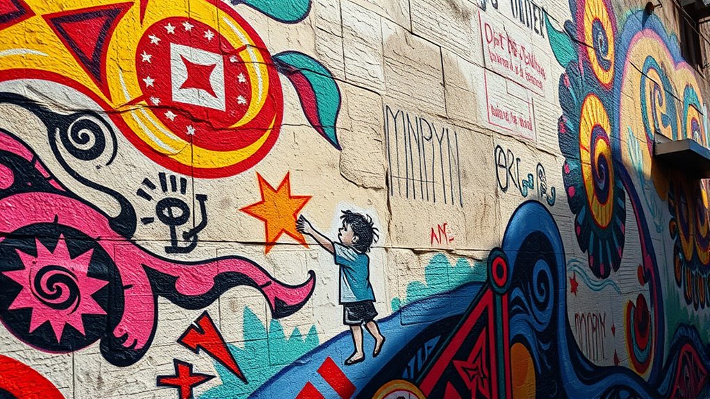
Visual design isn’t just about making things look pretty; it’s a powerful tool for telling stories that resonate with your audience. When you understand how to use visual elements effectively, you can guide viewers through a narrative without a single word. One of the most fundamental aspects of this is color theory. Colors evoke emotions and associations that can reinforce your story’s message. For example, warm hues like reds and oranges can evoke excitement, passion, or urgency, while cooler shades like blues and greens tend to create feelings of calmness and trust. By selecting your colors intentionally, you shape the tone of your story and influence how your audience perceives your message. When used strategically, color becomes a visual cue that guides the viewer’s emotional journey, strengthening their connection to your content.
In addition to setting the emotional tone, color can also direct user engagement. You want your audience to interact with your design—click, scroll, or share—and color plays a critical role here. Bright, contrasting colors draw attention to key elements like calls to action, navigation buttons, or important information. When you understand color psychology, you can create a visual hierarchy that naturally leads the viewer’s eye through your story. This not only makes your content more appealing but also more effective in conveying your message. For example, using a bold color for a “Buy Now” button ensures it stands out amid other elements, increasing the likelihood of user interaction. When your design guides users smoothly from introduction to action, you’re telling a story that’s both compelling and intuitive.
Furthermore, consistent color schemes reinforce your story’s identity and help establish brand recognition. When viewers see a cohesive palette, they associate it with your message, strengthening their emotional attachment. As they navigate your design, the consistent use of color creates a seamless experience, making your story feel unified and purposeful. You can also use color contrast to highlight changes or shifts in your narrative, signaling a new chapter or a call for attention. Additionally, understanding how the contrast ratio affects image quality and readability allows you to optimize your visual storytelling for better engagement. When you master these techniques, your visual storytelling becomes more than just attractive images—it becomes a dynamic, engaging experience that keeps your audience invested from start to finish. In the end, understanding and applying color theory and user engagement principles empowers you to craft visual stories that resonate deeply and leave a lasting impact.

Dirnun 4th of July Decorations Red White and Blue Lights with 40 Led Big Stars, 4th of July Lights for Indoor Outdoor Home Garden Golf Cart Patriotic Theme Memorial Independence Day Decorations
Perfect 4th of July Lights: These red white and blue star string lights which is similar to the...
As an affiliate, we earn on qualifying purchases.
Frequently Asked Questions
How Can Color Psychology Enhance Storytelling in Visual Design?
You can enhance storytelling in visual design by leveraging color psychology through color symbolism and emotional impact. Use colors that evoke specific feelings—like red for passion or urgency, blue for calmness, or yellow for optimism—to connect with your audience on a deeper level. Thoughtfully selecting and combining these colors guides viewers’ emotions, strengthens your message, and makes your story more compelling and memorable through visual cues.
What Are Common Mistakes to Avoid in Visual Storytelling?
Like steering through a crowded street, avoiding visual clutter and inconsistent style keeps your story clear. You should steer clear of overloading your design with too many elements, which confuses viewers. Also, maintain a consistent style to guarantee your message stays cohesive. Don’t let disorganized visuals distract from your narrative—focus on simplicity and harmony to effectively tell your story through visuals.
How Does Cultural Context Influence Visual Storytelling?
Cultural context shapes your visual storytelling by influencing the symbols and storytelling traditions you choose. When you understand cultural symbols, you guarantee your visuals resonate authentically with your audience, avoiding misinterpretations. Incorporate storytelling traditions relevant to your target culture to deepen engagement and authenticity. Ignoring these aspects can lead to misunderstandings or offense, so research carefully and adapt your visuals to reflect the cultural nuances that make your story meaningful and respectful.
What Tools Are Best for Creating Compelling Visual Narratives?
You should use a combination of infographic techniques and thoughtful typography choices to create compelling visual narratives. Infographics help simplify complex ideas and guide viewers through your story seamlessly, while strategic typography emphasizes key messages and maintains visual interest. By balancing these tools, you engage your audience more effectively, making your narrative memorable and impactful. Always tailor your design elements to your story’s tone and your audience’s preferences.
How Can Feedback Improve Visual Storytelling Effectiveness?
Imagine your visual story as a vibrant tapestry, where each thread must align perfectly. Feedback sharpens this fabric, boosting viewer engagement by highlighting what resonates and what falls flat. It guarantees aesthetic consistency, making your narrative seamless and compelling. Embracing critiques allows you to refine details, enhance clarity, and evoke stronger emotional responses, ultimately transforming your visual storytelling into an immersive experience that captivates and leaves a lasting impression.

ReyeeInc Solar 4th of July String Lights, 100 Stars and 39.4FT Outdoor Waterproof Patriotic Lights, Solar Battery Operated Fourth of July Lights for Golf Cart, Camping, Outside Decorations
Show Your Patriotism: ReyeeInc red white and blue outdoor lights are a stunning and patriotic addition to Memorial...
As an affiliate, we earn on qualifying purchases.
Conclusion
As you craft your visual design, remember it’s more than just colors and shapes—it’s the vessel for your story’s heartbeat. Like a lighthouse guiding ships through darkness, your visuals illuminate ideas and emotions, leading viewers on a journey. Every line, hue, and space becomes a symbol, whispering secrets and sparking imagination. Embrace this power, and your design will not just tell a story but invite others to live it, transforming simple visuals into timeless tales.

LAMPHOME Red White and Blue Patriotic String Lights, 33FT 100 LED Plug in Fairy Lights with 16 Lighting Modes & Timer, 4th of July Decorations for Independence Day Memorial Day Home Garden Decor
【Patriotic Star & Flag String Lights】LAMPHOME 33FT patriotic string lights come with 100 LEDs, designed with classic pentagram...
As an affiliate, we earn on qualifying purchases.
2Pack 400LED Smart Color Changing Fall String Lights | 164FT App Controlled Orange Lights, Waterproof RGB LED String Lights with Remote & Timer, Music Sync Multiple Modes Indoor Outdoor for Fall Decor
RGB String Lights with 16 Million Colors | The smart LED color changing string lights can display up...
As an affiliate, we earn on qualifying purchases.