
In 2025, your typography choices should balance tradition and modernity. Serif fonts, with their elegant strokes, work well for print and formal branding, conveying authority with a classic touch. Sans-serif fonts dominate digital platforms, offering clarity and simplicity for screens. The trend leans toward thoughtful pairing—combining the two for contrast and personality—ensuring your designs are both engaging and easy to understand. Keep exploring how these styles evolve to elevate your projects further.
Key Takeaways
- In 2025, digital design favors sans-serif fonts for clarity, while print continues to utilize serif fonts for tradition and elegance.
- Font pairing combining serif and sans-serif enhances visual hierarchy and aesthetic appeal across mediums.
- Minimalist sans-serif fonts dominate digital interfaces, improving readability on diverse screens and resolutions.
- Serif fonts remain essential in print for conveying authority and sophistication, especially in formal or luxury branding.
- Trend awareness and thoughtful font pairing are vital for creating balanced, modern, and effective typographic designs.

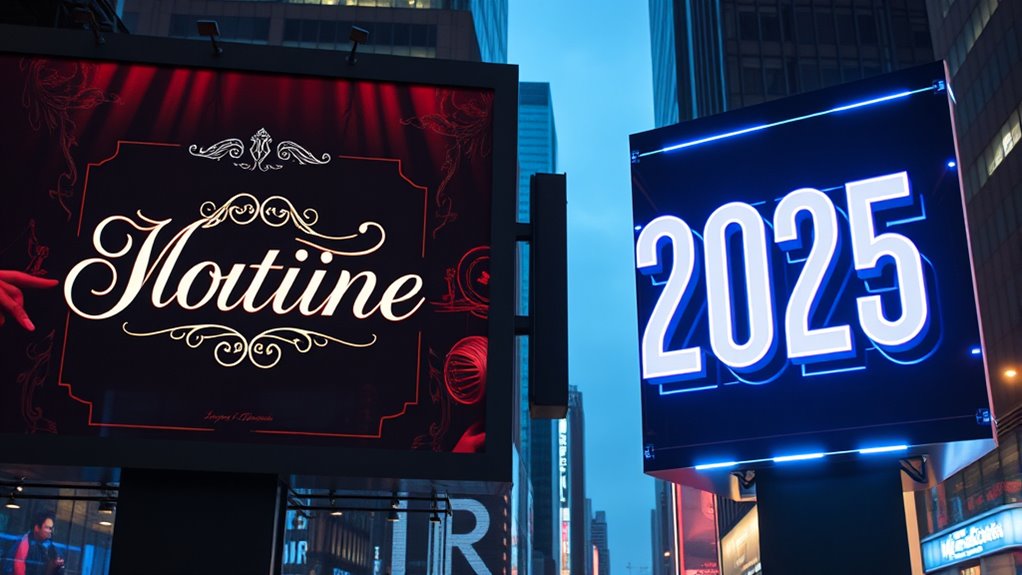
Typography trends are constantly evolving, shaping how we communicate visually in both digital and print mediums. As we move into 2025, understanding the ongoing debate between serif and sans-serif fonts becomes more important than ever. You’ll notice that designers are experimenting with font pairing strategies to create dynamic, yet harmonious, compositions. This approach isn’t just about aesthetics; it’s also about improving readability. When choosing between serif and sans-serif typefaces, you should consider how each can serve your message and your audience.
Serif fonts, with their decorative strokes at the ends of letters, are making a subtle comeback for certain applications. They evoke a sense of tradition, authority, and elegance, making them ideal for print materials like magazines, books, or formal branding. However, their intricate details can sometimes hinder quick readability on digital screens, especially at smaller sizes. That’s where font pairing becomes essential. Combining serif fonts with clean, modern sans-serif typefaces can create a visual hierarchy that guides the reader effortlessly through your content. This pairing improves readability by differentiating headings from body text and providing visual cues that help users process information faster.
Serif fonts evoke tradition and elegance but need pairing with sans-serif for digital clarity.
On the other hand, sans-serif fonts continue to dominate digital interfaces in 2025 due to their simplicity and clarity. Their clean lines make them highly legible across various screen sizes and resolutions, which is imperative for online content. If you’re designing a website, app, or digital ad, opting for sans-serif fonts enhances user experience and makes your message accessible. But don’t dismiss serif fonts entirely; integrating them selectively can add personality and sophistication. Thoughtful font pairing allows you to balance modern minimalism with classic elegance, giving your design depth without sacrificing readability enhancements.
Additionally, the trend towards font pairing strategies reflects a broader movement in design to combine traditional and modern elements for more engaging visuals. In your projects, striking the right balance between serif and sans-serif fonts means understanding their strengths and limitations. You should consider the context and medium: serif fonts for printed materials and long-form reading, sans-serif for digital and quick-glance content. Also, pay attention to contrast, spacing, and size to optimize readability. When pairing fonts, choose ones that complement each other stylistically but also guarantee clear differentiation. Doing so will help your audience engage with your message more effectively, whether they’re reading on a smartphone or flipping through a magazine.
Ultimately, staying aware of typography trends in 2025 involves more than just picking the latest styles. It’s about making intentional choices that enhance communication, foster visual harmony, and improve readability. By mastering font pairing and understanding the unique qualities of serif and sans-serif typefaces, you’ll create designs that are not only stylish but also highly functional. This balance guarantees your message resonates clearly across all mediums, keeping your audience engaged and your design fresh.

CSB Legacy Notetaking Bible, Tan LeatherTouch, Black Letter, Wide Margins, Journaling Space, Single-Column, Reading Plan, Family Records, Easy-to-Read Bible Serif Type
As an affiliate, we earn on qualifying purchases.
As an affiliate, we earn on qualifying purchases.
Frequently Asked Questions
How Will AI Influence Typography Choices in 2025?
AI will considerably influence your typography choices in 2025 through AI-driven customization and predictive font design. You’ll be able to create unique, tailored fonts that match your brand’s voice effortlessly. AI analyzes user preferences and project requirements, suggesting best font styles quickly. This seamless integration helps you make smarter, faster decisions, ensuring your typography stays modern, relevant, and engaging, all while saving time and enhancing your creative process.
What Are the Environmental Impacts of Font Production?
They say “you reap what you sow,” and this holds true for font production. The environmental impacts of font manufacturing involve resource consumption, waste, and energy use. By choosing sustainable design practices, you can reduce these effects and promote eco-friendly fonts. You have the power to influence change, ensuring that your typography choices support a greener future for digital and print media alike.
Will Handwriting Styles Impact Digital Typography Trends?
Handwriting styles will definitely influence digital typography trends. As you explore the calligraphy revival and personalized lettering, you’ll notice a shift toward more unique, handcrafted designs. This impact encourages designers to incorporate elements of traditional handwriting into digital fonts, making them feel more personal and authentic. Expect to see a blend of modern sans-serif and serif fonts with handwritten touches, creating a more expressive and approachable visual language.
How Does Accessibility Shape Font Selection in 2025?
Accessibility in 2025 acts like a lighthouse guiding your font choices. You’ll prioritize font size adjustments to guarantee readability and consider color contrast considerations to make content accessible for all users. By doing so, you create an inclusive experience that helps everyone, regardless of visual ability, navigate your digital space effortlessly. Your focus on these elements shows your commitment to making content welcoming and usable for every visitor.
Are There Emerging Font Technologies to Watch For?
You should watch for emerging font technologies that enhance font pairing and typographic consistency, like AI-driven tools that suggest ideal combinations and adaptive fonts that adjust for readability. These innovations help you create cohesive designs and improve accessibility. Staying updated with these advancements ensures your typography remains fresh, accessible, and visually harmonious, giving you a competitive edge in 2025’s evolving design landscape.

Comic Sans: The Biography of a Typeface (The ABC of Fonts Series)
As an affiliate, we earn on qualifying purchases.
As an affiliate, we earn on qualifying purchases.
Conclusion
As you navigate the evolving landscape of typography in 2025, picture yourself crafting designs that breathe with personality—serifs adding a touch of elegance like delicate brushstrokes, while sans-serifs bring sleek modernity, like a clear blue sky. Trust your instincts to blend these styles, creating visuals that captivate and communicate. Embrace the contrast, and let your typography paint a vivid story that leaves a lasting impression in every pixel you touch.
font pairing for website headers
As an affiliate, we earn on qualifying purchases.
As an affiliate, we earn on qualifying purchases.

Adobe InDesign Classroom in a Book 2025 Release
As an affiliate, we earn on qualifying purchases.
As an affiliate, we earn on qualifying purchases.