Kinetic typography brings your text to life by combining motion design with words for engaging digital media. You can transform static text into dynamic visuals that highlight key messages, evoke emotions, and guide viewers through your story. By using purposeful animation styles like bounce, slide, or fade, you can make your message memorable and impactful. If you keep exploring, you’ll discover how to craft compelling, visually stunning text that captures attention and enhances communication.
Key Takeaways
- Kinetic typography combines motion design with text to create engaging, lively visuals that enhance storytelling and emotional impact.
- It uses purposeful animations like bounce, slide, or warp to emphasize key messages and guide viewer attention.
- Motion styles reflect the mood of the content, such as sharp movements for excitement or slow transitions for calmness.
- Effective kinetic typography balances readability with dynamic movement, ensuring text remains clear and impactful.
- It serves as a powerful digital media tool to communicate complex ideas quickly and memorably through visually animated text.

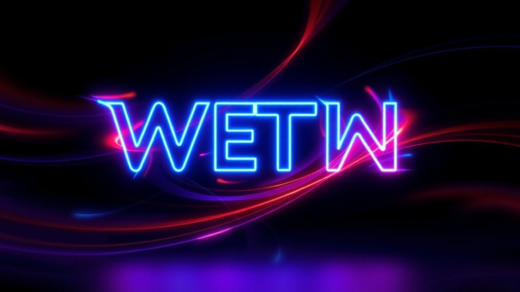
Have you ever noticed animated text that moves dynamically on screen, grabbing your attention and enhancing the message? That’s the magic of kinetic typography in action. This technique combines motion design with text to create engaging visuals that communicate ideas more effectively. When used skillfully, kinetic typography transforms static words into lively characters that tell stories, evoke emotions, and guide viewers through a narrative. It’s not just about making text look cool; it’s about using movement to deepen understanding and make messages stick.
Animated text that moves on screen to tell stories, evoke emotions, and make messages memorable through dynamic motion.
In digital media, kinetic typography is a powerful tool for visual storytelling. Unlike traditional static text, moving words can emphasize key points, mirror the tone of the message, or illustrate concepts directly. For example, rapid, sharp movements can generate excitement or urgency, while slow, flowing motions might evoke calmness or nostalgia. By aligning the movement style with the message’s mood, you create a cohesive experience that resonates with your audience. This dynamic approach helps you communicate complex ideas quickly and memorably, making your content stand out in a crowded digital landscape.
Motion design plays an essential role in bringing kinetic typography to life. It involves carefully planning how each element moves, accelerates, and interacts. You might animate text to bounce, fade, slide, or warp, depending on what works best for your story. The key is to keep the animation smooth and purposeful. Overly flashy or chaotic movements can distract viewers or dilute the message, so restraint and clarity are essential. When executed well, motion design guides the viewer’s eye naturally, highlighting important words or phrases and creating a visual rhythm that enhances storytelling. It’s about making the text not just readable but also emotionally impactful.
Using kinetic typography effectively requires understanding your message and your audience. Think about what you want to convey and how movement can support that. If you’re explaining a process, animated steps or sequential motions can clarify each phase. If you’re inspiring action, energetic, pulsating text can motivate viewers. The goal is to make your message more engaging without overwhelming the viewer. When combined with good visual storytelling, kinetic typography can turn simple words into a compelling narrative device. It’s a way to add personality, emphasis, and clarity—all through the artful use of motion.
Additionally, incorporating principles from contrast ratio can enhance readability and visual impact, ensuring that animated text remains clear and compelling even during rapid movements.

CHDITB Motivational Quotes Frame Canvas Wall Art, Inspirational Wall Decor, Set Of 6 Positive Affirmation Posters For Women, Uplifting Artwork Encourage Art Prints For Home Office Living Room-8”x10”
EMPOWERING QUOTES & MODERN DESIGN:Set of 6 high-quality canvas prints featuring inspirational quotes like "You can do hard...
As an affiliate, we earn on qualifying purchases.
Frequently Asked Questions
How Does Kinetic Typography Influence Viewer Engagement?
Kinetic typography boosts your viewer engagement by capturing visual attention through dynamic, eye-catching text movements. It also enhances emotional impact by emphasizing key messages, making content more memorable. As you watch, the lively animations guide your focus and evoke feelings, keeping you interested and connected. This active interaction with the text encourages deeper engagement, making the overall experience more immersive and effective in conveying your message.
What Software Is Best for Beginners in Kinetic Typography?
You should start with user-friendly typography tools like Adobe After Effects, which offers great font selection and animation features suitable for beginners. Alternatively, try Motion by Apple or Canva’s animation tools, as they provide simple interfaces and plenty of font options. These software options help you experiment with kinetic typography without overwhelming you, allowing you to focus on creative font selection and smooth animations to bring your text to life effectively.
How Can Kinetic Typography Improve Storytelling in Videos?
Kinetic typography enhances your storytelling by making visuals more dynamic and engaging. You can emphasize key messages, guiding viewers’ attention and creating a stronger emotional impact. When you animate text to match the mood or tone, it amplifies the story’s emotional depth. This active use of movement and style transforms simple text into a powerful tool for visual storytelling, helping your audience connect more deeply with your message.
What Are Common Mistakes to Avoid in Kinetic Typography Design?
You should avoid inconsistent typography styles, which can distract viewers and weaken your message. Make certain motion synchronization so text movements match the rhythm of your audio or narrative, creating a seamless experience. Don’t overuse flashy animations or effects, as they can overwhelm viewers. Keep your design clean, maintain typography consistency, and align motion with the content’s tone. This approach keeps your kinetic typography engaging without sacrificing clarity or professionalism.
How Does Timing Affect the Effectiveness of Kinetic Typography?
You might think timing isn’t vital, but it truly shapes your message’s emotional impact. When you synchronize visual pacing with the content’s tone, your audience feels more engaged and connected. Precise timing guarantees words appear and move at the right moments, amplifying feelings and emphasizing key points. Without careful timing, even stunning animations can fall flat, so always consider how each beat influences the viewer’s emotional journey.
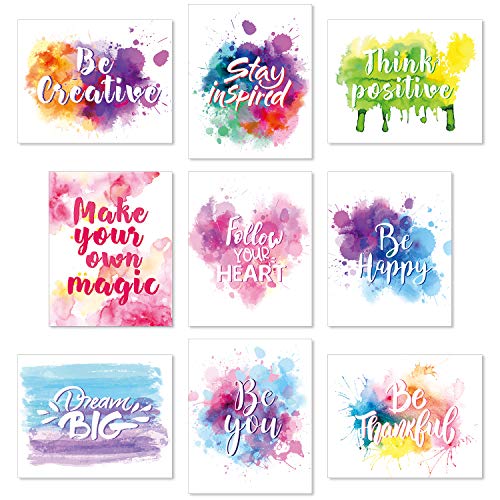
Outus Set of 9 Watercolor Inspirational Wall Art Prints Abstract Paint Motivational Quote Phrases Posters for Bedroom Living Room Office Room Decoration 8 x 10 Inch Unframed
Inspiring decoration: seeing our colorful abstract unframed motivational prints can always keep your day positive and create your...
As an affiliate, we earn on qualifying purchases.
Conclusion
Don’t underestimate the power of kinetic typography; it’s more than just flashy visuals. By bringing text to life, you can captivate your audience and enhance your message’s impact. Some might think it’s distracting, but when used thoughtfully, it guides viewers seamlessly and deepens engagement. So, embrace kinetic typography as a tool to elevate your digital media projects—it’s an effective way to communicate clearly and creatively, making your content truly stand out.

Ploceiny Inspirational Office wall art Motivational poster for home decor Positive Quotes wall prints Encouragement Gifts Positive Sayings for preppy room Wall Decor A-288
Transform your living room, bedroom, bathroom, or office into a vibrant space with our graffiti wall art that...
As an affiliate, we earn on qualifying purchases.

HoneyKICK Nelson Mandela Inspirational Quote Canvas Wall Art - Motivational Wall Decor for Office, Bedroom, Living Room - Abstract Wall Art for Women Office Decor Framed Canvas
NELSON MANDELA QUOTE IN GALLERY-WRAPPED CANVAS: One of history's most impactful voices, rendered in gallery-wrapped canvas with finished...
As an affiliate, we earn on qualifying purchases.